Another Google Chrome CSS bug
Since I moved my blog from blogger I've noticed on many occasions that Chrome would screw up the text rendering on the first view of a page. Hit F5 to refresh and it goes away. For a long time I thought this was related to my use of web-fonts (the excellent Google Web Fonts, but in fact its simpler than that.
Eventually I took the time to look into it a bit more, and narrowed it down to the fact that I am using the text-rendering:optimizeLegibility css directive, which does make a nice difference to the kerning of the fixed-width fonts I'm using (Ubuntu Mono), but also has the apparent side-effect of setting negative margins on those fixed-width texts which make them run into/over surrounding text.
Once I'd figured out what was causing my problem a quick Google search showed I'm not alone. The chromium issue tracker has several relevant bug reports. I chose to add my tuppence to bug 96936
Examples of the bug
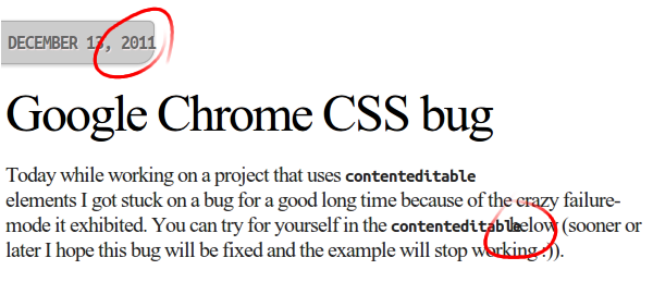
Here's what the problem looks like when text-rendering:optimizeLegibility is in use in Chrome 15 (and the as yet unreleased 16 beta):

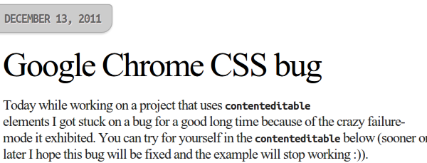
And here (and also now in the blog you are reading) is how it looks without optimizeLegibility:

If you are reading this in Google Chrome you can check to see if the bug still exists by taking a look at the example text below, which is taken from the sample I submitted to bug 96936. If you see overlapping characters below, the bug is not fixed in your version of Chrome.
Code blocks inside paragraphs like this don't look very nice with text-rendering set to optimizeLegibility.
Note: Some interesting characteristics of the bug include:
- Text renders correctly if you refresh the page after the initial visit
- It appears much worse with certain fonts - fixed-width/monospace fonts in particular seem to suffer
- The width of the text appears to be calculated incorrectly, not just margins - you can see this in the first screen-shot where the date tab cuts into the end of "2011".

