

Linux Distro popularity
Interesting to see how Ubuntu has overtaken its sire Debian in recent years - Google Trends really is amazing.

Ubuntu (blue), Debian (red), CentOS (green) and Suse (orange)
Here's the link to see the full google-trends page for this comparison.
I love the spikes on the ubuntu line every 6 months - I imagine these coincide with the 6-monthly .4 and .10 releases (April and October).
Interestingly, when I compare Ubuntu with Windows 7 and OSX, OSX loses out strongly to Ubuntu (perhaps I'm using the wrong term, but I tried a number of different combinations), while Win7 is around 3x more popular than Ubuntu. Also interesting to note how OSX beats Ubuntu in the "news" mentions (below the x-axis) presumably because of the Apple PR machine:
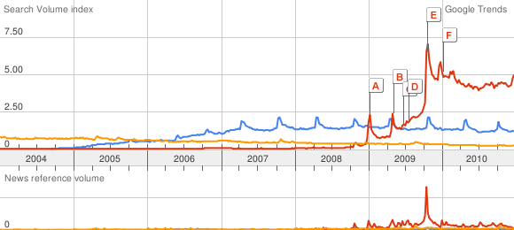
Ubuntu (blue), Windows 7 (red), OSX (orange)