

Creating comic-book style icons with Gimp
I've long had a love-hate relationship with Gimp. I hate the MDI interface - all those windows really grate on my nerves. I love that its a really great and full-featured graphics package, and free.
In the past I've fired it up to do all kinds of little jobs, but never really tried to use it to compose artwork of any complexity from scratch. That changed recently when I needed to create some nice icons for my Android app Comic Strip It!.
Finally, and almost by accident, I've learned how to use paths, masks, and layers, as well as a few of the filters, and managed to turn out some icons that I'm not too embarrassed by! Here's some examples:


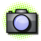


Since the app is all about creating comic strips I wanted icons that really fit with that idea, so I spent some time looking at comics and comic graphics.
The half-tone effect - coloured dots printed in rows at different sizes and angles to create the illusion of different shades of colour - figures heavily in print comic-books, and has a such a recognisable stylistic effect that I settled on using that as much as possible. My attempts at re-creating it aren't "real" half-tones, but I think the effect works.
A few working practices
I drew all my icons at 512x512 pixels, then re-scaled for use. Android wants 4 different sizes to cater for four different screen densities (low - 32x32, medium - 48x48, high - 72x72, extra-high - 96x96).
Drawing at the much larger size of 512x512 just makes it much easier to work, covers minor errors once you scale down, and means that you usually end up with a decent quality scaled image.
I save all the original icons using Gimp's native XCF file format, which retains the layers and masks and so on - this means I can always go back later and make small changes if I need to (and I did, many times).
Because my laptop runs Ubuntu I saved my icons in a folder shared by Ubuntu One (cloud backup and replication), but this didn't always work out well - connectivity issues on a few evenings meant that I got conflicting versions between my laptop and my desktop, and it wasn't too easy to sort out.
In future I will use git, as that puts control of when you update in your hands, and provides explicit versioning and access to old versions. I've upgraded to a paid github account now that my app is live in the Android Market, and all my source-code lives there now.
So, to the icons...
Creating a halftone background
Almost all of my icons use a circular splash of half-tone colour as a background. It took me a good long time to figure out how to do this properly, but once you know how its done its actually very quick to re-create.
Step 1: The background gradient
First, create a new 512x512 file, and paint a linear gradient filling the entire image. To paint a gradient:
- select the "blend" tool, and make sure its send to "linear blend"
- select foreground and background colours as the start and end colours for your gradient
- hold down the left mouse-button in one corner of your image, move to the diagonally opposite corner and release the button to paint the gradient
I picked a deep orange foreground colour, a paler orange-yellow background colour, and drew the gradient from bottom-left to top-right, resulting in the following image:

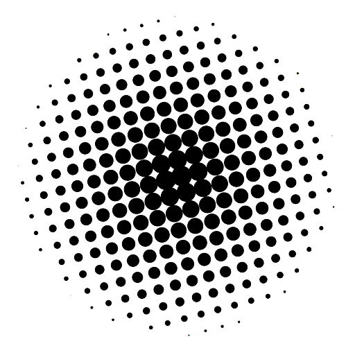
Step 2: The half-tone mask
To create the half-tone dot effect we're going to use one of Gimp's built in filters - "News-print". We want the dots to cluster heavily in the middle, then space further apart and get smaller the further they are from the centre of the image. Here's how we do that:
- Create a new layer, above the existing colour gradient. I like to do that directly in the "Layers" palette by right-clicking and choosing "New Layer", making sure to select "Transparency" as the layer fill type, and give it a name (I usually call this layer "bg_halftone").
- Make sure the layer is above your colour gradient in the layer palette. If it isn't, click and drag and drop it above the background layer.
- Select the "blend" tool again, and choose full black as the foreground colour, and full white as the background colour. This time we want to do a "radial blend".
- Move the mouse to the centre of your image, hold down the left button, and drag towards the right-hand edge. When you release the mouse you'll get a disc with a black centre, graduating through grey on a white background, as shown below.

Now we're going to convert the smooth black-to-white gradient of our disc to a half-tone effect. We'll do that using the News-print filter:
- From Gimp's "Filters" menu, choose "Distorts -> Newsprint"
- Increase the cell-size to something reasonably large - 25 to 30 works well if you're going to scale the final image down as I did. If you won't be scaling the image down, stick to something less than 10.
- Visit the three colour channel tabs (red/green/blue) and set the same angle in all of them. I'm using 15 in this example.
- Finally, set the anti-aliasing oversample to 15, and apply the filter.
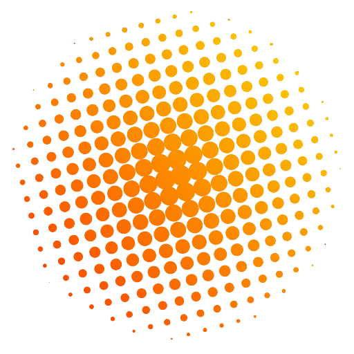
Step 3: Allowing the colour to shine through the mask
Almost done! We just need to let the colour shine through from the background layer. I tried various ways of doing this. Masks worked well, and "Select->By Color" isn't bad (but does'nt capture anti-aliased areas perfectly). Eventually I got into the habit of a much simpler way:
- From Gimp's "Colors" menu choose "Color to Alpha"
- Click the colour-box (from:) and select full black
- Click OK and you'll see your background gradient shine through the dots
Note: If you noticed that the dots don't quite match up between the following image and the others on this page, its because I added this image after I originally posted, and had to re-create it because I had already deleted the .xcf file I originally used while writing this post. Oops.
For completeness, here's the "Select->By Color" method, which I don't use any more because it involves more steps and leaves the dots with slightly jagged edges:
- From Gimp's "Select" menu, choose "By Color", and then select the white background of the image.
- Invert the selection (ctrl-i) so that the black dots are now selected. (We could have selected the black dots initially, but I find that if you do this you end up with black artefacts after the next step)
- From the "Edit" menu choose "Clear", or hit the delete key, if you have one (my laptop doesn't). You should now see the gradient colour from your background layer shining through the holes you just made in the top-most layer.
- De-select (ctrl-a) and merge the two layers (right-click in the layers palette and choose "merge visible..")
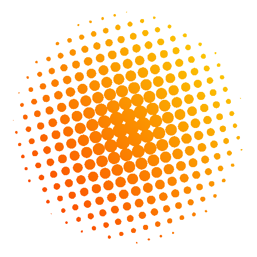
Notice that the edges of the dots in this version of the image are decidedly jagged, compared to the version created by using the colour-to-alpha technique. This is to do with the select-by-colour method not including anti-aliasing pixels that are closer to white than black in the selection.
Step 4: Optional - de-focus for use as a background
I used this technique to create the backgrounds for my icons, adding one more step: gaussian blur to de-focus the background and make the foreground icon stand out nice and sharp.
I used the same technique to pattern-fill the icon detail by using paths and selections. I'll save the details of that for another post.
blog comments powered by Disqus