

Paths and Selections in Gimp
As I mentioned in my previous post, I've been learning to use Gimp so I can produce icons for my apps. The most significant new finding for me has been the discovery of paths and how to use them in combination with selections.
The ability to use set operations to combine selections in different ways, and to remember selections as paths opens up a whole world of possibilities. Lets look at a really simple example:
Fire up the Gimp, and create a new image to work on. I'm going with a 512x512 canvas again. Choose the oval selection tool and draw an oval on your canvas, then hold down shift and draw another oval that overlaps the first a little. (I was already surprised that I could add to the selections like this actually!)
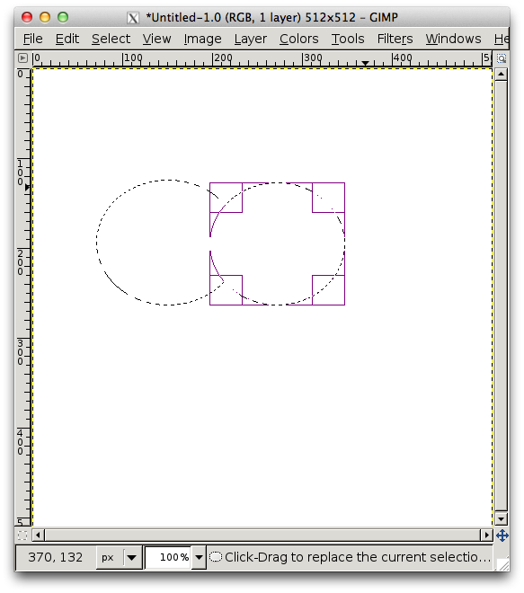
Now, in the "Layers, Channels, Paths, .." window, open the paths tab, and click the "Selection to Path" icon (red circle with black lines above and below). You'll see a new entry added in the palette for your current selection shape. Here's how mine looks at this point:

There are immediately some neat things we can do:
- We can recreate this same selection at any time by selecting the path in the paths palette and clicking the "path to selection"" icon (the red square icon with dotted outline).
- We can "Stroke" this path (draw around its outline), using the currently selected tool, brush and colour, by clicking the paint-brush icon on the paths panel.
- We can add to or subtract from this selection using other selections, by drawing a new selection then holding down shift/ctrl/shift+ctrl and clicking the "path to selection" icon.
- We can add hand-drawn shapes to our path by using the path tool to create them, then adding them to a selection as described above.
One thing I found very useful, is that you can convert text to a path, which allows you to get creative with the stroke and fill used on that text. I'm going to clear my canvas and add some text:
- Select the text tool, click on the canvas and enter some text (I went with "Hello!")
- Increase the font size so that the text just fits on the canvas (I'm using Trebuchet MS bold italic at 175px). You might have to grab the corners of the text selection and expand it so that you can see all of the text.
- Move the text into the centre of the canvas.
- On the tool window, in the section at the bottom containing the tool controls, look for a button that says "Path from Text" - should be right at the bottom. Click it.
- Open the paths dialog again (from the layers, channels, paths.. window) - you should see that you now have a path called "Hello!", which looks like an outlined version of your text.
Now you can stroke and fill your text, convert it to a selection (allowing you to paint only inside or only outside), and generally do all kinds of neat things. For example:
- Switch to the "layers" dialog, and delete the floating text layer.
- Switch back to the "Paths" dialog again, click the "path to selection" icon
- Pick a nice colour to outline your text with (I've selected a deep blue)
- Invert your selection (ctrl-i) - this is so that we only paint around the outside in the next step
- From the "Paths" dialog, click the stroke icon
- In the dialog that pops up, set the stroke width to be around 10. Because we are stroking the line at the edge of the selection, half of the stroke width falls inside the text outline and will not be painted because it isn't part of our current selection. Click OK to stroke the path.

Now lets paint a gradient inside our text:
- From the "paths" dialog, click the "path to selection" icon
- From the tool palette, select the gradient tool
- Choose a foreground and background colour for the end-colours of your gradient (I'm going with red and yellow)
- Click and hold the left button in the "H" of your text, then drag over to the "!" before letting go of the button. A gradient will be painted inside your text outline only.
